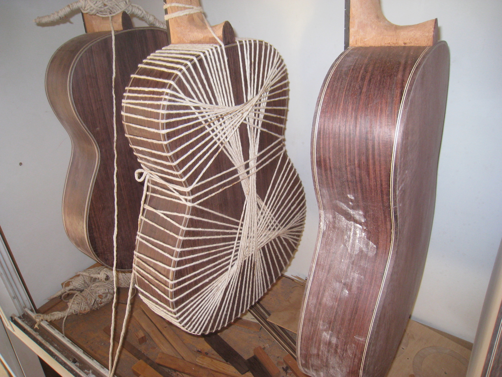
We needed a logo for the Association of Guitar-makers and I had a few offers from web developers and designers but there was really no interest among the members to spend money on that sort of thing. So I thought maybe I could do something: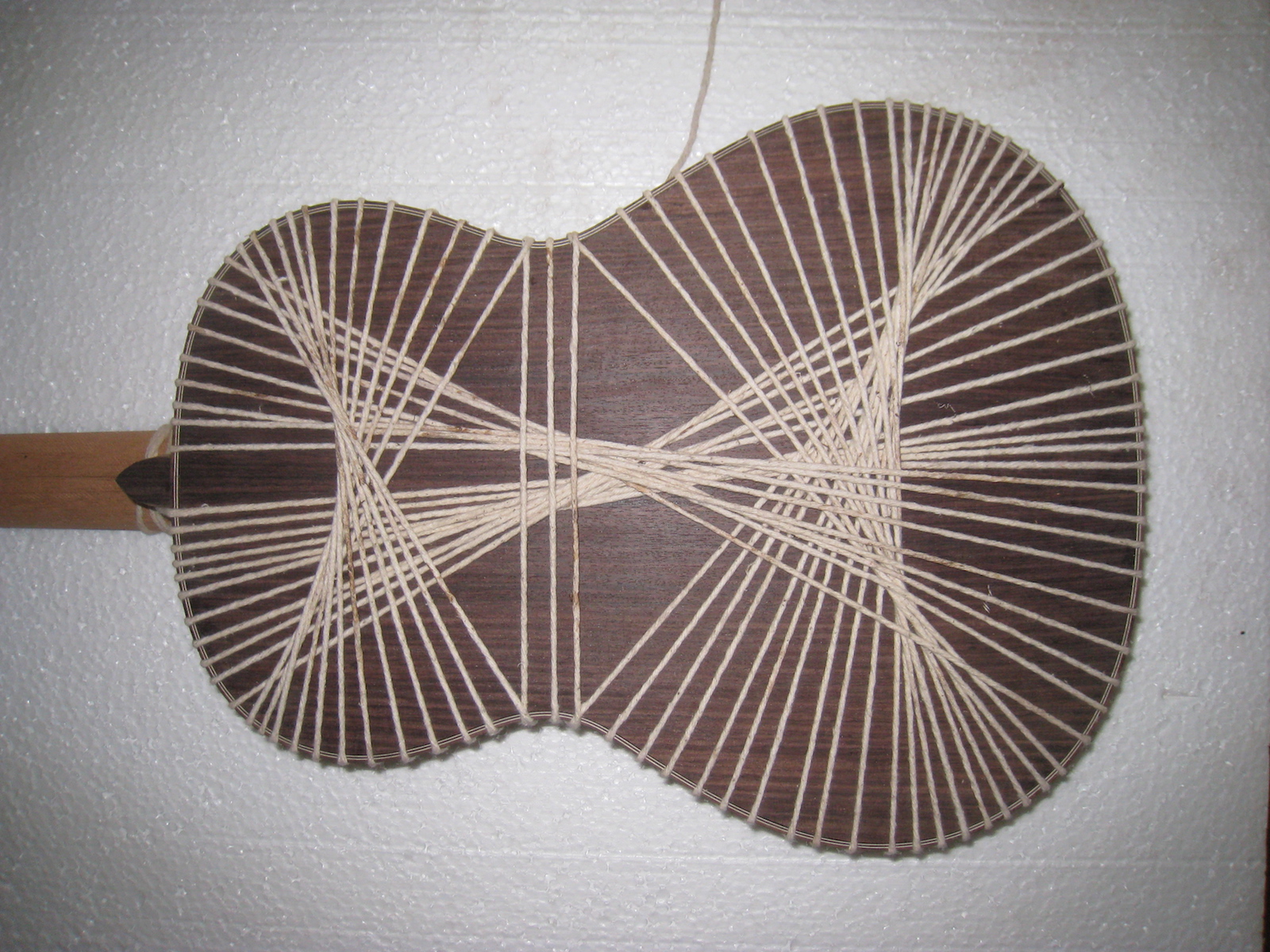 I took a photo of the guitar after wrapping it up in string the way we do to glue the back on. We do this in order to put light pressure on all points of the back and to be able to heat it up afterwards.
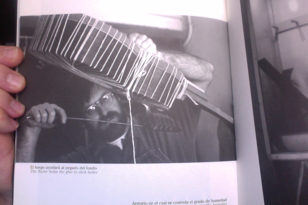 In this case I wasn’t glueing the back on but rather trying to get the perfect shot so the guitar is a completed one and I didn’t do it on the solera.
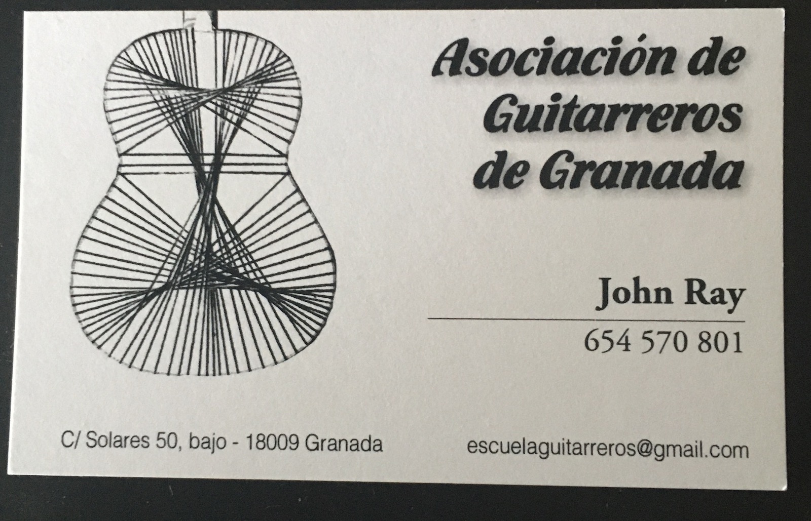
 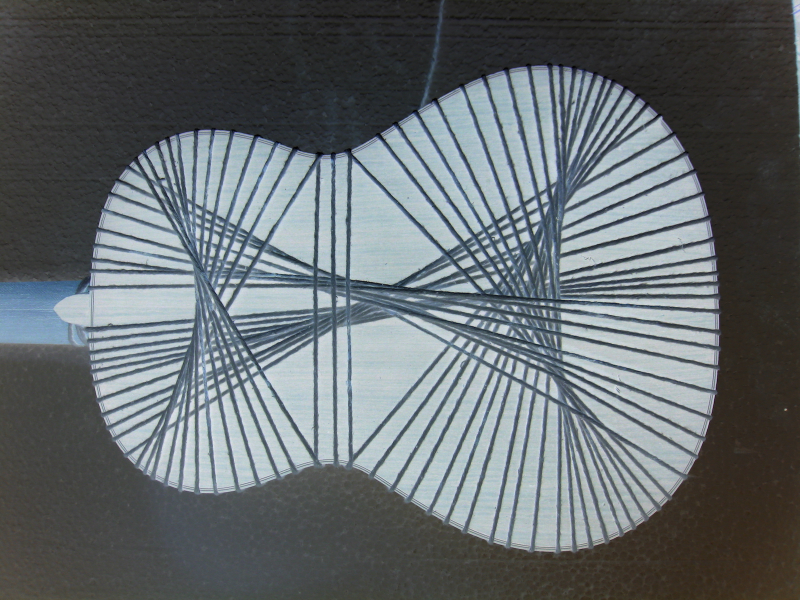 I was then able to negativize it and clean it up and get rid of the background. Then it was a matter of reducing it to black and white.And of course to find the right orientation. Of course deciding how to do it and trying different photos initially is what took the most time. And here is the final result on a business card. I love it because it really represents us but is simple and aesthetically pleasing.
Great Guitars of the Past
John Ray Guitar-maker
